What to include
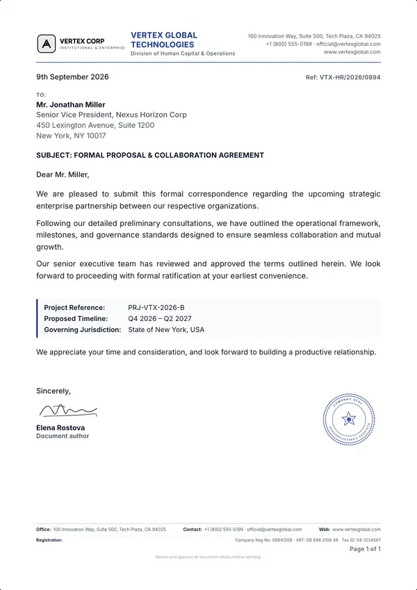
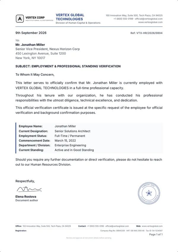
- Logo and organisation name.
- Postal address.
- Phone number, email and website.
- Company registration and tax/VAT numbers where local rules require them on business correspondence.
- Optional: a tagline, department name or accreditation badge.
Registration details, banking information and legal notices often sit better in a footer, keeping the top of the page clean.
Size and margins
- Paper: A4 (210 × 297 mm) in most of the world; US Letter (8.5 × 11 in) in North America.
- Header height: keep the letterhead within the top 27–45 mm so it doesn't push the recipient's address out of the envelope window (see DIN 5008).
- Margins: 20–25 mm on each side, matching the body text.
Layout options
- Modern: logo left, contact details right. Balanced and the most common choice.
- Centred: logo and name centred at the top — formal and traditional.
- Split / executive: name and tagline on one side, contact block on the other with a strong divider.
- Minimal: typography only, no logo — clean for consultancies and personal letterheads.
Typography and colour
- Use one or two typefaces at most, matching your brand.
- Keep contact details small (8–9 pt) so the letter's content stays the focus.
- Use one accent colour for the divider line or company name; keep body text dark for readability and printing.
- Check that the design prints well in black and white.
Keeping every letter consistent
The most common letterhead problem isn't design — it's drift. In a word processor, logos and address blocks move as people edit. A locked template keeps the letterhead fixed while only the content changes. In Letter Studio you set the letterhead once and every template uses it, on screen and in the exported PDF.
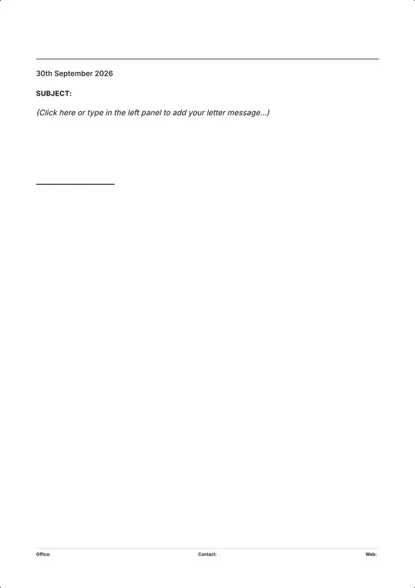
Tip: You can also export a letterhead with an empty body and print it on good paper for handwritten notes or pre-printed stationery.
Test the letterhead with real content
Judge the layout with both a short message and a longer letter. A large logo can look attractive on an empty page yet squeeze the body when you add an address, subject and signature. Test the same branding on a continuation page instead of repeating the entire header.
- Add a six-line recipient address and a two-line subject to expose space problems.
- Add a normal letter and a longer message that continues onto another page. Check the signature is not isolated.
- Export and print a grayscale proof at actual size. Check that the logo, contact details and body remain readable.
- If using window envelopes, test a folded copy and confirm that only the intended address information is visible.
Keep branding distinct from authority
A company seal, signature image or QR code is a visual element. It does not authenticate the contents of a letter or prove that the signer is authorised. Only use branding you have permission to use, and follow the institution's issuing process for bank references, enrollment confirmations and other official documents.
Sources and scope
These references support the topics described below. Our worked examples are fictional and are not official forms. Requirements can differ by recipient and jurisdiction.
- Purdue OWL — Writing the Basic Business Letter
US business-letter structure and formatting conventions; adapt to the recipient's requirements.
- DIN Media — DIN 5008:2020-03
Official standard listing and scope. The full standard is a paid publication; this guide is a practical introduction, not a certification of compliance.
For a correction or a template issue, contact the Letter Studio team. We do not claim legal review or certification of these guides.